Power Apps provides multiple ways to represent data with just out of the box configurations, without writing any code. In my specific case, there is a requirement to get accordion view of list data on Power Apps. Let us understand, how this could be achieved with elements available on Power Apps.
Let us get the data from SharePoint list, and show the accordion view. The accordion view has to be created by grouping the list items. In our case, we will show the jobs list in the accordion view, grouped under each business/technical group. The jobs list present on SharePoint data contains title and category, where category is grouping element.
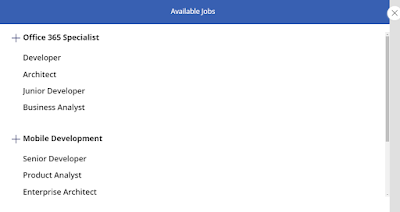
After following the steps/configurations, the final accordion view will look like the following snapshot.
 |
| SharePoint list data - Accordion view with collapsible option |
Let us look at the step by step approach to configure app to get the accordion experience.
Configure Power App Screen with necessary elements
- Create a new app on Power Apps, and insert a new screen.
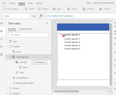
- Insert a new flexible height gallery, and insert/keep elements like title, and icon to show job category as expandable item.
- And insert one more gallery inside the existing gallery. In the inner gallery, only title is retained to show job title.
 |
| Elements to be configured for Accordion view |
- Now, connect both galleries to SharePoint list, and configure to show groups and related items.
- Connect data sources.
- Search for SharePoint, and click on add new connection.
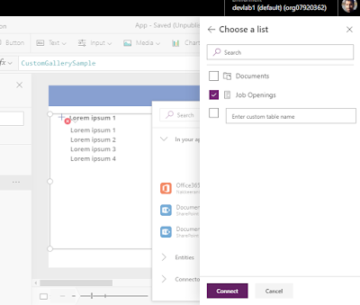
- Select a SharePoint site, and choose a list. Then click on Connect.
 |
| Data source will be SharePoint list containing job information |
- Configure grouping elements for accordion view
- In the outer gallery, insert the grouping function under items property. The following snapshot shows the job categories grouped. This option filters/groups and shows unique group data. Job Openings is list name and Category is SharePoint column name, and Categories is the group name for this element.
 |
| Group by category - Category information pulled from SharePoint list |
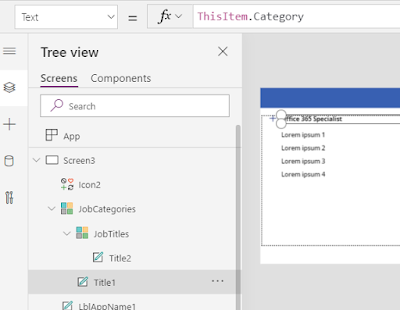
- Inside outer gallery, select the label text, and select to show the job categories from SharePoint list.
 |
| Show Group Category as Headers |
- Configure to show items under each group
- In the inner gallery, list all the items associated with the group/category.
 |
| Configure data source for list under each group/category |
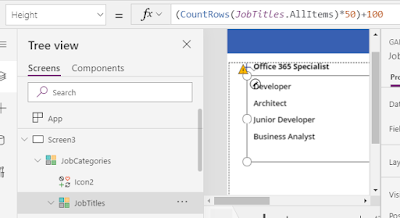
- Set the height of gallery to change dynamically. The following shows the dynamic view.
 |
| Configure height property for list to change dynamically |
The following snapshot shows the jobs grouped under each category.
 |
| SharePoint data listed with grouping |
Make group/category collapsible
Next let us have work to get the accordion like experience. To get this, let us show the list/gallery once the group is selected.
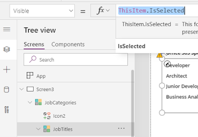
- Select the inner job lists group, and select visible property.
- To show the gallery once user select, change the property to be ThisItem.IsSelected.
 |
| Making groups collapsible on click of group/category |
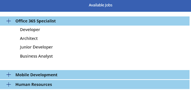
This ensures accordion like experience. And make necessary user interface changes to look better. The following shows the final result.
 |
| SharePoint list data - Accordion view with collapsible option |

