Let us look how to integrate and show the Office 365 SharePoint data on to Power BI reports. In this specific use case, we will look how to SharePoint data as map views.
Consider a very basic scenario of showing organization location-wise user count on Power BI dashboards. So in this case, the organization data is available as SharePoint list, and consider only two parameters, that is location and user count.
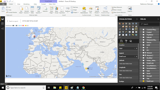
The below snapshot shows the data loaded onto Power BI. Let us see step by step approach below.
 |
| PowerBI Report showing the SharePoint List Data as Locations on Map Visualization |
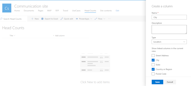
The list has been created with name head counts. First column is created as location field, with showing city and country in the view.
 |
| Adding Location Field onto SharePoint List |
Steps Involved:
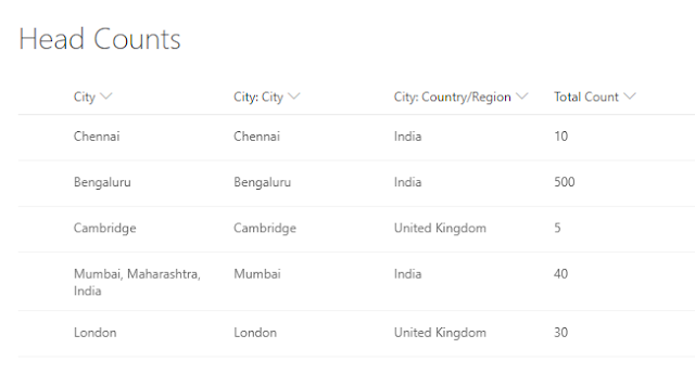
1. Select additional options to show in the location field, namely City and Country. Second column is created as Total Count, as number field.
 |
| Office 365 SharePoint List - with geographical data |
2. Install Power BI on your desktop. While opening the Power BI desktop version, you will be prompted for Office 365 login. In my case, this setup has been done. From ribbon, select get data drop down and select more.
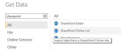
3. Select SharePoint Online List as source.
 |
| Select Office 365 SharePoint Online as source for PowerBI |
4. In the SharePoint lists popup, provide the site URL, where list has been created.
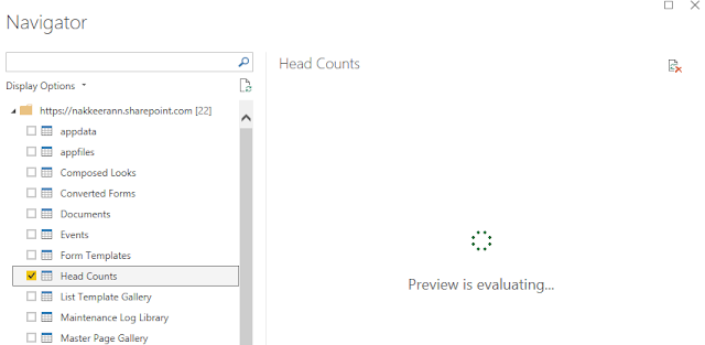
5. Then the navigator will be loaded with the lists available on the SharePoint site. From the navigator, select the list. (Heads Count)
 |
| Select List |
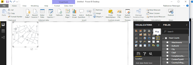
6. Then select the Map from visualization.
 |
| Selecting Map as Visualization for PowerBI |
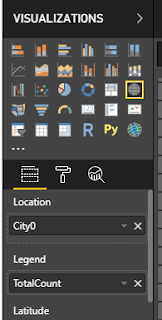
7. In the location, select (or drag-and-drop) the city0 field. And in the legend option, select the total count field.
 |
| Select Fields |
In the left pane, the map will be loaded with the list data.
 |
| Showing SharePoint data on Power BI - Locations |

